Tuesday 24 November 2009

Digi-pack ideas

CD Cover

Front:
As we are looking to link the Digi- Pack to our general idea of our music video. One idea we have settled on would be a design that shows the main character (Lewis Bird) on the front cover of the album positioned in the centre and taking up about 2/3rds of the album with quite a dark, possibly black and white theme, then have the title in a striking colour, possibly red or blue.

Back:
The back of the CD cover will have the same colour theme but will be set maybe in a field with the horizon, using the same colour scheme, and have either one or two main women lead singers doing different expressions or positions all over the back cover. then we will include the song list horizontally in the horizon.
Monday 23 November 2009

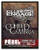
Analysis of Magazine advert


This is a magazine advert for an old Killswitch Engage tour. The advert distinctly shows killswitch engage and coheed and cambria as the two main acts. These are both metal bands, and the logos for both of them represent that through their font; it's big and eye catching.

The background to the poster is made up of Killswitch engage's most recent self titled album's graphics. This shows that KSE were the main band playing. The Graphics themselves are very stereotypical of metal; aggressive, harsh and usually depicting death. The ones here show a snake in tribal style drawing.

The relevent information such as dates and locations of the tour are located at the bottom of the advert. The first thing that the eye travels to is the names of the bands, before moving down to the bottom of the page for the infomation.

Friday 20 November 2009

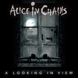
Analysis of 'A looking in view' Single Cover


CD cover

Alice in Chains - A Looking in View

Genre - metal

This is Alice in Chains single from their album 'Black Gives Way To Blue.'
The cover uses artwork that represents what the name of the song is 'A looking in View' The main part of the artwork that the eye moves to first is the window, and the moon in behind it.

It follows genre characteristics as metal is usually associated with death, horror and pain. The artwork is dark and gives the impression of death. This gives me an immediate understanding of what the music will be like.

Another feature of the song cover is the name of the song; A Looking In View. There is a picture of an eye in the left part of the window that appears to be 'veiwing' what is on the otherside. This relates to the song name and makes me understand what the song is about.

Analysis of a CD Cover


CD Cover

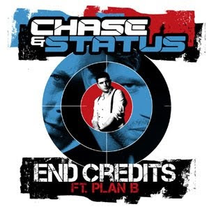
Chase & Status Ft. Plan B - End Credits

Genre - Drum And Bass

One thing that i can see from the cover is the striking and effective coloring, as it only uses 4 colours of red, blue, black and white and with the colour it focuses on the main parts of the cover as the title is in blue and white contrasting with the background so it highlights the artists. Also the artists are in whole colours as the main ones are in blue and the featured artist is in white.

Another feature is that they have included all the artists with the main artists in the background and then Plan B who's featuring in a smaller position. They are all placed in the sight of a cross hair as it relates to what the song has been made for which was a London film called Harry Brown.

As it is related to a London Based Film they have made the style of the CD cover quite gritty and have made the style of the font faded and makes it suit the genre as it makes it look grimy to represent the film and the genre. This will help our group as ours will be a darker or gritty CD cover and will take some aspects of this cover such as the font and maybe look at the colours as our music video is a dreary, gritty looking video which will relate to our cover.

analyze of advert


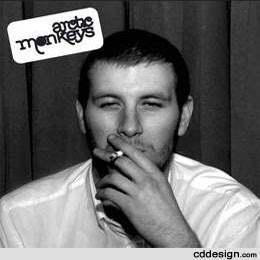
Analysis of 'Whatever people say that i am, That's what im not' CD cover


This is the debut album by Arctic Monkeys. This is something that we will take influence from when we create ours. This is because it represents the same style as our music video. The black and white photo is something we may aim to do. Its simple and effective and it shows what genre of music to expect.

Thursday 19 November 2009

Definition of Digi Pack

A Digipak is a patented style of compact disc or DVD packaging, and is a registered trademark of AGI Media.

Digipaks typically consist of a gatefold (book-style) paperboard or card stock outer binding, with one or more plastic trays capable of holding a CD or DVD attached to the inside. Since Digipaks were among the first alternatives to jewel cases to be used by major record companies, and because there is no other common name for Digipak-style packaging made by other companies, the term digipak is often used generically, even when the media holder is a hub or "Soft Spot" rather than a full plastic tray.

Digipak-style packaging is often used for CD singles or special editions of CD albums and the tall DVD Digipak (DVDigipak)is used as a premium package for DVDs and DVD sets. Because such packaging is less resistant to abrasion than jewel cases, it tends to show signs of wear relatively quickly.

Feedback From Other Groups

Positive feedback

-Generally very good, we successfully managed to make the video feel depressing and moody.

-The variation of shots was very good, we managed to make each individual shot clear, but we also managed to prevent the audience from being bored.

-continuity is another strength of our video. We managed to make each shot connect to the next without the main character appearing to move back in time, or forwards.

Constructive criticism

-We would need to include a bit more variation in the events that happen, perhaps make them a little faster or different to each other.

-We could also use a stronger ending, make it more conclusive through use of sound, or finish on a part of the song that would make the video end better.

Our final Music video

Friday 6 November 2009

Teacher Feedback

This blog is missing a lot of info such as location shots, screen grabs of your editing, screen grabs of specific shots you have filmed - along with discussion from you - analyse the work you have produced as you go along to show that you are trying to improve everything you do. This group MUST film as soon as possible and take a still camera with you when you do to take photos for your other two products.

Response to feedback

We believe all the feedback that we received was valid and useful.
We understand that it needs more footage and we are in the process of filming more but we did have some issues with the camera when were out filming initially so we didn't manage to film anywhere near as much footage as we wanted to. Also we don't believe that a performance element is necessary too our film as the while point of the video is that it is a narrative video as apposed to a performance style video. Also we can understand it being a little boring at points at the moment as to make a rough cut out of the amount we managed to film we had to manage with what we had and unfortunately parts may seem a little boring but they will be attained to when we have filmed the rest of our footage. again when we can film more we will sort the car crash scene out as that is actually going to be the end scene and not in the middle.
Thanks for all your feedback it shall be taken into consideration when we are able to edit more!

feed back from roughcut

positive
-lots of good variety
-cuts are to the beat of the music, with key events fitting in with the music
-mixed relationships
-like the narrative structure
-good editing with a lot of variety

negative
-needs more footage!!
-perhaps add a performance element to it
-can be a little boring at points
-car crash could use more drama

Thursday 5 November 2009

Roughcut


This is an unfinished version of our rough cut. The camera that we used on the day of filming had a technical issue with the battery, it wouldn't charge properly. We are going to have to find a new time to shoot so that we can correct the shots that were taken at the wrong time.

Target audiences

Our target audience would include younger people, most likely teenagers to young adults. This is because our video takes influence from other videos by bands like Arctic Monkeys. The target audience for the actual band that made the song, Camera Obscura, would be a much more mature audience. This is because the video is bright, cheerful and simple. Our video is much darker, it shows a gang attacking another man, it is violent and completely contrasts the music.

problems with the editing

We have encountered a problem with the editing in that the shots we have were filmed at different times of the day, so we have a mix of very light day-time shots, and darker night shots. This is major setback and means that we will have to try and gather the original cast and choose what sort of lighting we want, then get a camera out and work out the times when we can shoot.
 
© 2009 GROUP 35 - Music Video 2009/10. All Rights Reserved | Powered by Blogger
Design by psdvibe | Bloggerized By LawnyDesignz