 character. Other videos that we took influence from such as ‘As the Sun Goes Down’ by Arctic Monkeys and ‘Bitter Sweet Symphony’ by The Verve, both of which used little to no performance/lip syncing in their music videos, and we felt that this would make ours look more professional and appear as part of the genre much better than if we had included lip syncing. The song that we used for our music video is called ‘If Looks Could Kill’ by Camera Obscurer. The song itself is upbeat and positive, but the lyrics do depict desperation and almost despair with lines like ‘Tell me where it all went wrong’. The official music video uses lots of special effects such as reversing the parts of the footage and using mirror style effects, it combines these effects with the use of strong bold colours and a performance based narrative to create a music video that fits the characteristics of a pop video. It gives the video a surreal feel, and combined with the performance element, creates a very positive mood. We challenged that style with a negative mood and a different perspective on the idea created by the band itself, in our version of the video, the main character appears oblivious to everything around him; we wanted to show how bad his life is; we show him on his journey from work to home, and all the small threats and stressful events that make his life depressing and negative.
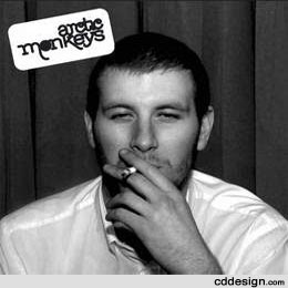
Our Print product ideas for the magazine advert and the digipack, were created after the video had been finished, we wanted to continue with the style that we had used for the music video, which was dark and negative, using low lighting and a black and white lighting effect. We used Arctic Monkeys ‘Whatever people say that I am, that’s what I’m not’ album cover as our main influence because of how basic, but how powerful it is. It sets the mood for Arctic Monkeys perfectly because of its genre characteristics; the genre being Indy/alternative, and the characteristics including the use of darker and moodier colour, and trying to make the video show a grittier side to life. The CD cover uses a black and white portrait of a man we don’t know and have never seen before, but at the same time, the man fits perfectly to those genre characteristics mentioned. We wanted this gritty effect with our digipack, so we took our main character to a street location and photographed him at night walking down a busy street. We manipulated the image in Photoshop, desaturating the colour and making it black and white, we used a blur tool to turn the background slightly out of focus, and then added the title to the top right corner of the cover in a muted purple colour, we originally wanted to have it in bold, but we changed our idea because a pastel style colour would suit the genre characteristic better; the title keeps the same negative tone as we managed to produce in the images. I think that the effect works perfectly to convey what the mood of the video is. We used similarly dull, muted colours in the images in the back and the inside of the digipack to continue this negative mood.
2. The combination of our music video and ancillary texts works very well in a number of ways; the digipack and the magazine advert both convey the mood of the music video. This allows the consumer to know what genre the music video will be. The music video itself reflects all of this. We wanted to make both the digipack and the magazine advert hard hitting and eye catching to the consumer through the use of colour and the photos that we used. We did this by keeping the
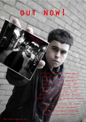
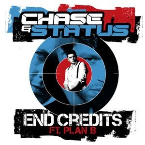
 magazine advert text minimal, and adding the digipack cover into the image of our main character through Photoshop. This makes the advert clear and to the point. We included tour dates and the title in bold red text font to make the text eye catching. This also makes both advert and digipack recognisable and memorable. The Arctic Monkeys song ‘When the Sun Goes Down’ was a big influence on not just the video but both digipack and advert as well because of how memorable it is. We also found influences from other genres of music such as Drum and Bass, the duo act ‘Chase and Status’ and their digipack box for ‘End Credits ft Plan B’ was a large influence because of the way it uses its artists on the cover. We wanted to use this idea in both of the magazine advert and the digipack to give the two print products compatibility and to make them more effective in catching the consumer’s eye.
3. The feedback that we gathered from our audience was very positive and very helpful, it included how the tour dates were a good idea, how the images on the digipack and the magazine advert relate to the video, how the advert is good because you can see the digipack itself and so you can see what it is that is being advertised, and how wearing the same clothes in both the images (background and digipack photo) is very good and shows continuity between the advert and the digipack. Other positive feedback included how the advert and digipack combine well to promote the artist. And how the colour scheme on the digipack works well to create a subtle, grittier mood than the magazine advert. Negative feedback and ideas that we may need to either include or work on in the future include; turning the magazine advert text into the same colour and font as in the digipack, this is to get the colour schemes correct, so that there is continuity between both print products. The magazine advert is hard to read because of how vivid the colour is compared to the background. We also need to include more information on the magazine advert. Usually they include ratings or links for more information and we couldn’t include these for lack of time, we had problems with organisation, some of our group could film but some couldn’t and that led to tension regarding who had the most responsibility. Another point that the audience feedback helped us to identify is the fact that it is hard to understand the reason we have included the images of the
 two girls. We used these because we wanted to show the rest of the band in the digipack.
Feedback on music video was also very positive, we managed to make the video very depressing and moody, but we managed to keep it simple and easy to follow. Something else that was picked up on was the variation of shots that we used; we wanted to make sure that each new scenario that the main character encounters, such as the gang of kids, and the being hit by a car, appeared different to each other. A negative point was that we hadn’t included enough action or points of interest throughout the video. This is something that we would defiantly take into account if we were to make a new video. The feedback we gained during the creation of the rough cut of the video helped us to identify this problem, however we found that we were having consistent problems with the camera; these included the battery not working problem, the charging unit not working and the fact that the first camera we were going to use didn’t work at all, and so we couldn’t get all of the shots that we needed, however, we did manage to get around these problems by re-organising shoots and when we would take the camera out. We also found that the ending was not strong enough; this is something that we would change if we had more time on the video. Preferences included using sound as a tool to make the video more conclusive, or using a part of the song to finish on that would suit the ending better. We have learnt through all of this feedback that we need to spend more time on the storyboarding and editing processes than just filming and working on the blog. We have also learnt that we need to listen to the songs and to plan out when certain events will happen and whether it will work with the music at that point in the song. We have also learnt that we need to demonstrate the products as much as possible to gather as much feedback as possible to make the product as good as possible. Feedback is something that all professional film makers use regularly to check if their products are to the standard that the target audience would like them to be.
4. We used a variety of different technologies throughout the creation of our media products; the music video, the digipack and the magazine advert. For our music video we used the video editing software Final Cut Express. This is industry standard editing software and is incredibly versatile. We only scratched the surface of its true editing potential, we really only used it to put our video in a linear order and to cut each clip to the right length of video, however the complex software meant that we could use lots of short snappy shots in a continuing order, this makes the video much more interesting to watch, even if the character is just walking across a road. One of the main things that can be seen straight away with our music video is the fact that it is in black and white. We did this for a number of reasons; the first is the fact that the video would not have worked without the desaturation filters due to the fact that we filmed during November, and we could only film during the early evening, this means it was daylight in the first half of a clip, and then night time in the second half. This ruined continuity, so we had to try and turn what shots we had to the same levels of contrast and light. There is still some noticeable difference, but it doesn’t stop the films continuity. With more time this is something that we would try and prevent from happening. Several shots in the film are slowed down to make the video flow properly, especially when we were using lots of shot-reverse-shots, we needed to make the video look professional and this tool helped considerably in doing so.
For the digipack and the magazine advert, we used the software Photoshop CS3. This is professional photo editing software and, like Final Cut Express, opens many doors to creating a work of art. For the digipack, we wanted to mute the colours to make the photos look more professional, so we used a mix of the colour curves tool on all three of the photos to take the colour out, and on the front cover we made the photo completely black and white, and added a blur to the background. This really helped in making the main
 character stand out, making him eye catching. For the magazine advert we muted the colours as we did with the digipack, but we managed to edit a photo of the main digipack cover into the advert, where the main character is holding a blank CD case; we didn’t have an actual print of the digipack cover at the time. We then used a transformation tool to stretch the digipack photo onto the blank CD case so it covered every angle, this made it look a lot more professional than if we had just scaled it to size and rotated it. The final magazine advert photo gives the impression that the actual artist is selling his music to the consumer. We also used Photoshop to create the CD template that gave us the three image spread. These new media technologies are key to creating what we have managed to make. Without the use of software like Final Cut Express and Photoshop, we would not have been able to create what we had to the right standard. The technology enables anyone to have a go at creating something special, not just professionals; they allow for anyone to produce their own professional standard looking films.
For the use of planning and research we used a blogging system to record all of our notes and ideas, including the storyboard, the rough cut, the final cut and both print products, this was also used to allow other groups to give us feedback and help with any issues we felt we had.
word count: 2,248
No response to “Dom's Media Evaluation”
Leave a reply